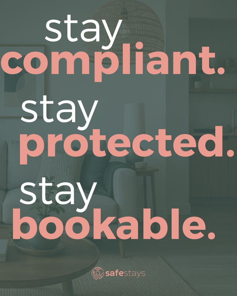
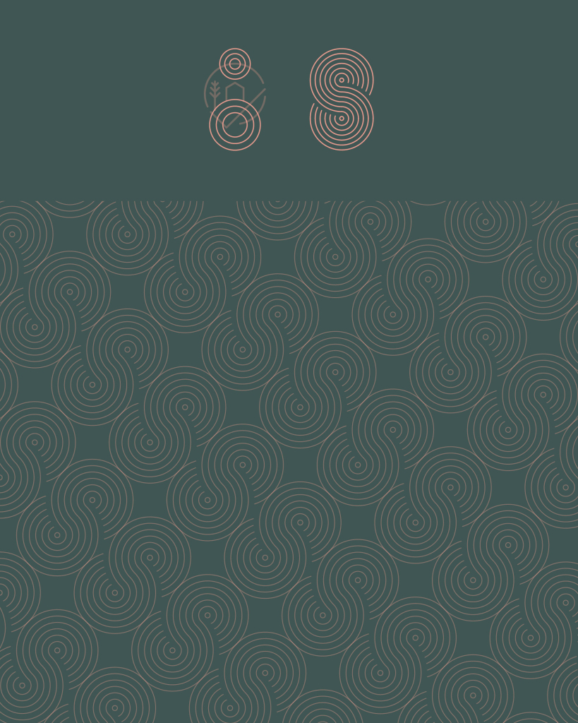
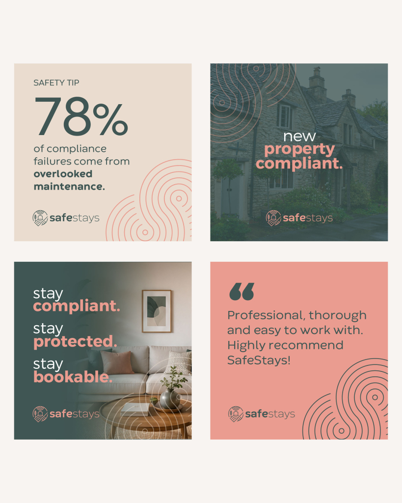
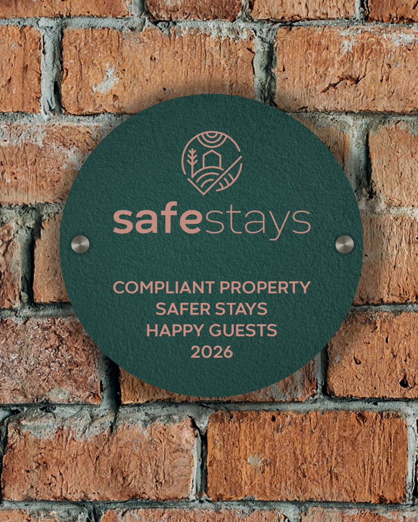
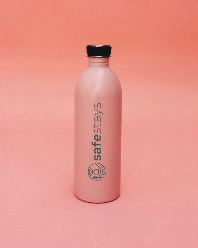
SafeStays needed an identity that felt as reassuring as the name itself. The logo was designed as a simple line art brand mark, keeping things clean, memorable and easy to recognise across every touchpoint. We shaped a clear statement, “Stay compliant. Stay protected. Stay bookable.”, giving the brand a clear message that speaks directly to its audience while reinforcing exactly what SafeStays helps them achieve.
A custom pattern using elements from the brand mark, added a subtle layer of personality that can be used across print, digital and social. Combined with a soft colour palette and clean typography, the result is a brand that feels approachable, modern and trustworthy.
Brand Design
Bespoke Logo
Colour Palette
Pattern Design
Social Templates
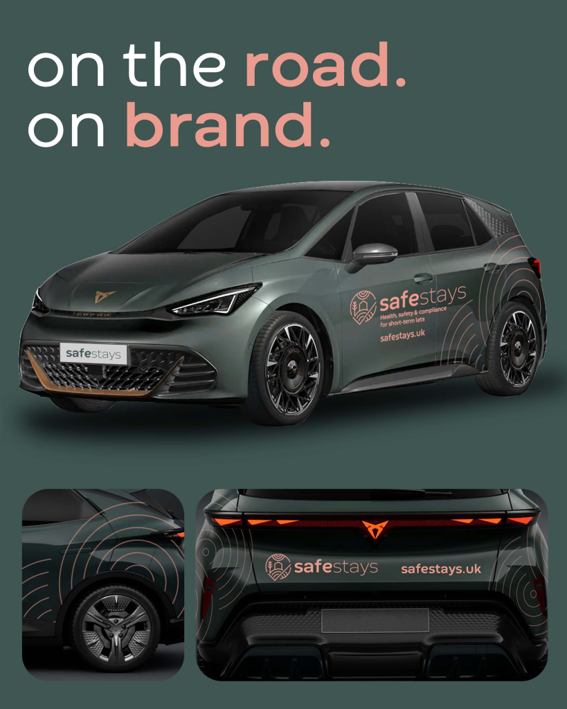
Vehicle Livery
Promotional Design
“Moko Studio was recommended to me by a friend and I’m so glad that I contacted them. Stu took the time to discuss my company and its direction before coming back to me with a number of options for branding including logo, colours, fonts, etc., all which my business partner and I fell in love with. After a few tweaks, Stu created the perfect branding for us. I can’t thank Stu enough and happily recommend.”
We use cookies to enhance your experience while using our website. If you are using our Services via a browser you can restrict, block or remove cookies through your web browser settings. We also use content and scripts from third parties that may use tracking technologies. You can selectively provide your consent below to allow such third party embeds. For complete information about the cookies we use, data we collect and how we process them, please check our Privacy Policy